Active Advice
Research and Design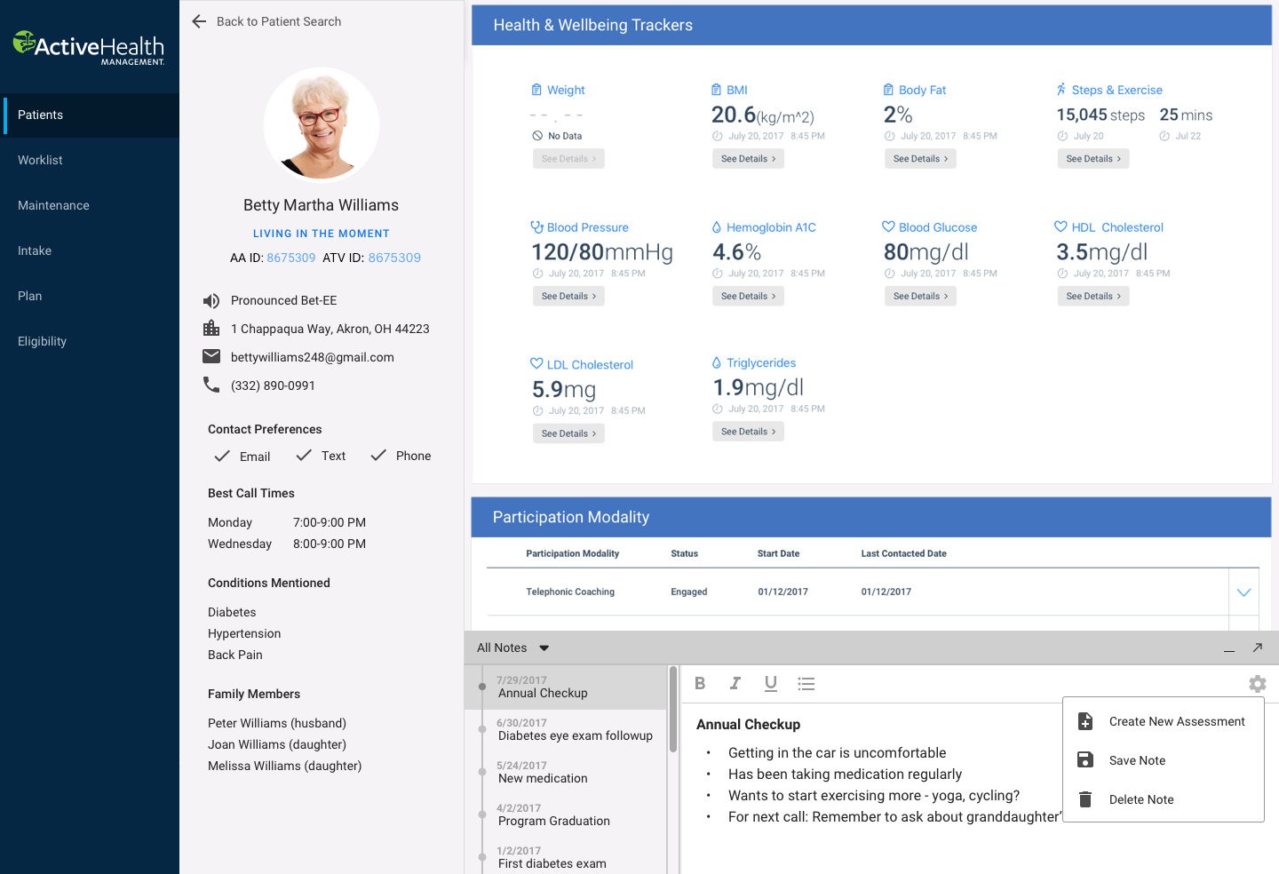
Active Advice is a care provider and EMR dashboard by Active Health Management (subsidiary of Aetna) that nurses use to discover and log information about their patients. They use Active Advice 5-7 hours a day and are usually on the phone with patients at the same time. Our objective was to revamp the existing dashboard to improve workflows and create a more intuitive experience for nurses.
We started by gathering information around existing user behaviors through phone and in-person interviews with nurses and supervisors in our Disease Management and Lifestyle Coaching groups.


The most common pain points were input lag and an overly complicated UI.
Timetrade (scheduling software) takes over a minute to make an appointment.
Disease Manager
I get distracted by the software, and patients I’m talking to can tell.
Disease Manager
Long Patient Messages workflow, no way to get back to previous screen.
Lifestyle Coach
Long load times between dropdown selections.
Lifestyle Coach
Hard to search by plan names, they’re named differently in different areas.
Nurse Supervisor
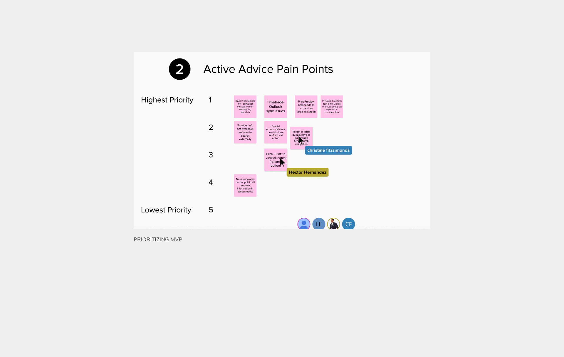
After gathering the information we needed from users, we used card sorting techniques to prioritize each pain point.
Building an EMR
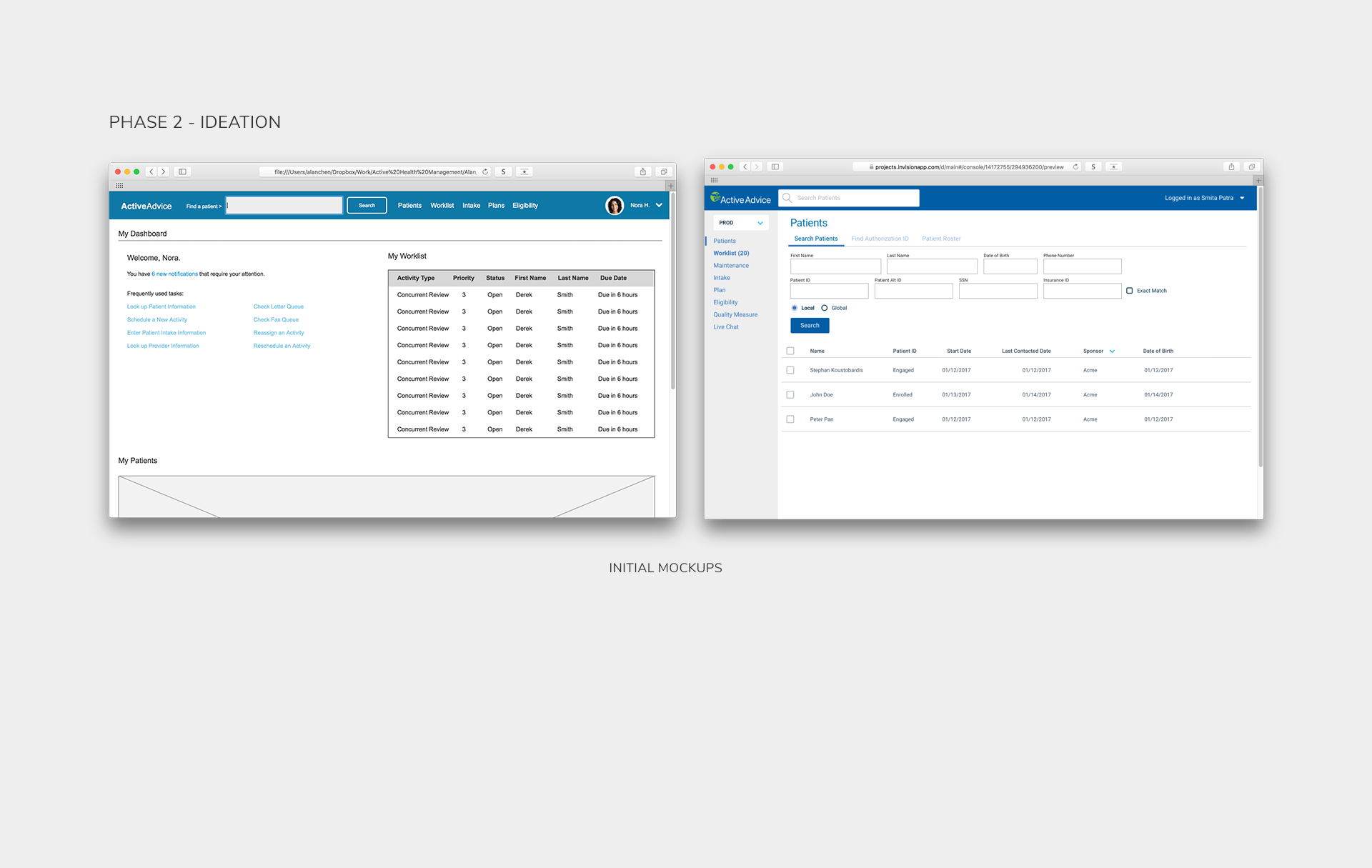
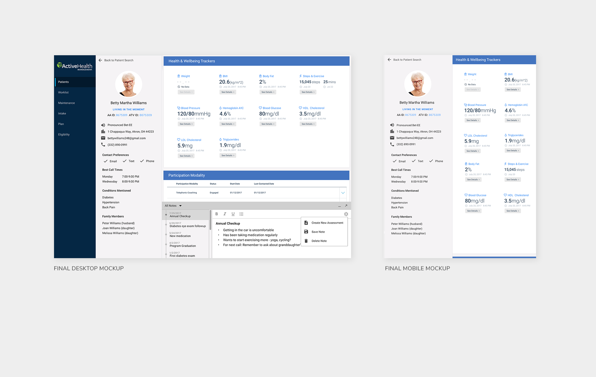
In the next phase, I began to design a more modern dashboard interface that reduced the number of pages required for key workflows.
The final design incorporated sticky panels including a patient info panel for quick access to information and a notes panel to give users a convenient area to take notes as they talked to their patients. Some feedback and notes from stakeholders included:
- Users need to be able to convey authenticity when dealing with members.
- Every user has different workflows and workarounds.
- Need to keep momentum going by expanding user outreach.
Users were generally excited by the proposed changes and inspired the leadership team to more closely engage with UX for future projects. Visualizing data using bubble charts and infographics was a powerful tool to convey findings and observations, which can be further shared throughout the entire organization.
Client: Active Health Management
Live Site: Not Available
Live Site: Not Available
UX: Alan Chen
Research: Christine Fitzsimonds, Alan Chen
Timeframe: Winter 2017 – Fall 2017
Research: Christine Fitzsimonds, Alan Chen
Timeframe: Winter 2017 – Fall 2017
Previous
TE Connectivity
Next